5 ways to double your form completion rate
Most forms lose half their respondents before the end. Here's how to design forms that people actually finish — from question order to progress cues.
The FormSnapp Team
June 18, 2026 7 min read
The average online form is abandoned by roughly half the people who start it. Every drop-off is a lost lead, an unheard opinion, or an incomplete order — and most of them are avoidable. Completion is mostly a design problem, and design problems are fixable. Below are five changes that consistently move the needle, ordered from the highest-leverage to the easy wins.
1. Ask for less
Every field is a small tax on the respondent. Before you add a question, ask whether you truly need the answer to act on it. A phone number you never call is friction with no payoff; a "company size" field that changes nothing about your response is just a speed bump. Cutting a form from ten fields to five routinely lifts completion by double digits — often the single biggest win available to you.
If a field is genuinely optional, mark it so, or better, move it to a later step so the respondent has already committed before they hit it. The goal is to make the first screen feel effortless.
2. Put the easy questions first
People finish what they start. Open with a low-effort question — a single choice or a short text field — so respondents build momentum before they reach anything demanding. This is the psychology of commitment: once someone has answered two or three quick questions, they're far more likely to push through a harder one like budget, long-form feedback, or a file upload. Save the effortful questions for the end, once they're invested.
3. Show progress
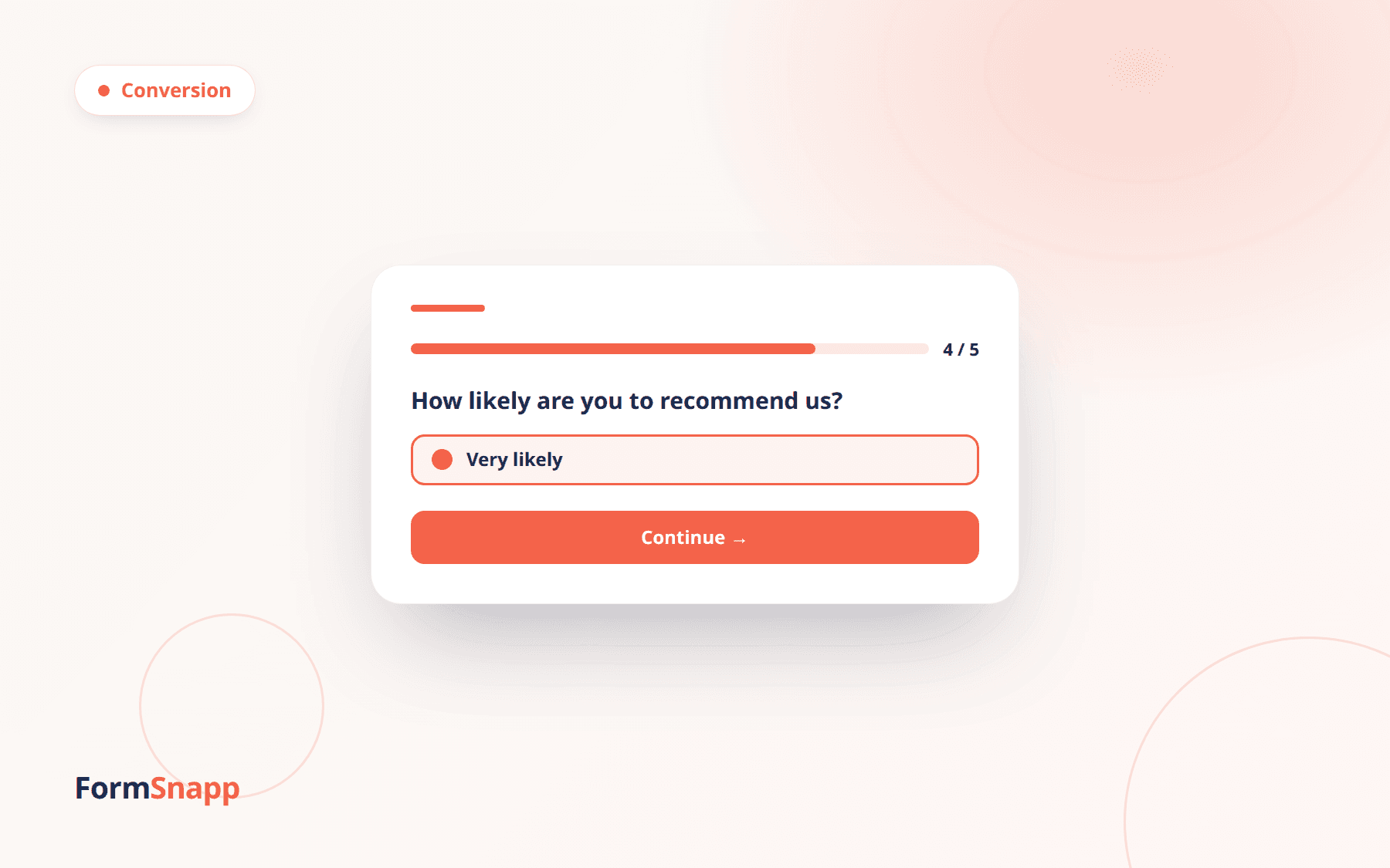
Uncertainty kills momentum. A progress bar or a simple "Question 3 of 6" counter tells people how much is left and turns an open-ended chore into a finite, achievable task. In multi-step forms this is one of the highest-leverage changes you can make — respondents who can see the finish line are dramatically more likely to reach it.
4. Design for the thumb
Most responses now come from phones, yet most forms are still designed on a desktop. A wall of fields that looks tidy on a laptop feels heavy on a small screen. A focused, one-question-at-a-time flow feels like a conversation and keeps thumbs moving. Generous tap targets, large text, and native inputs (a date picker, a number pad) remove the tiny frustrations that add up to abandonment.
5. Make it look trustworthy
Design is a proxy for credibility. A clean, well-themed form signals that a real organization is on the other end and that answers will be handled with care. A default, unstyled form does the opposite — it reads as spammy, and people hesitate to hand over anything personal. FormSnapp themes every form to look professional by default, so trust isn't something you have to build from scratch.
The bottom line
You don't need all five changes at once. Start by cutting fields and adding a progress indicator — those two alone will move your numbers. Then measure, and let the drop-off data tell you where to look next.
- Remove every field you won't act on.
- Front-load the easy questions to build momentum.
- Always show progress on multi-step forms.
- Design mobile-first, with big tap targets and native inputs.
- Theme the form so it looks trustworthy at a glance.
The FormSnapp Team
We build FormSnapp — beautiful forms that people actually finish, with analytics that turn every response into a decision. We write about forms, surveys, and getting better data.